First big visual pass
Make Out Loud ♪ coding ♪ design
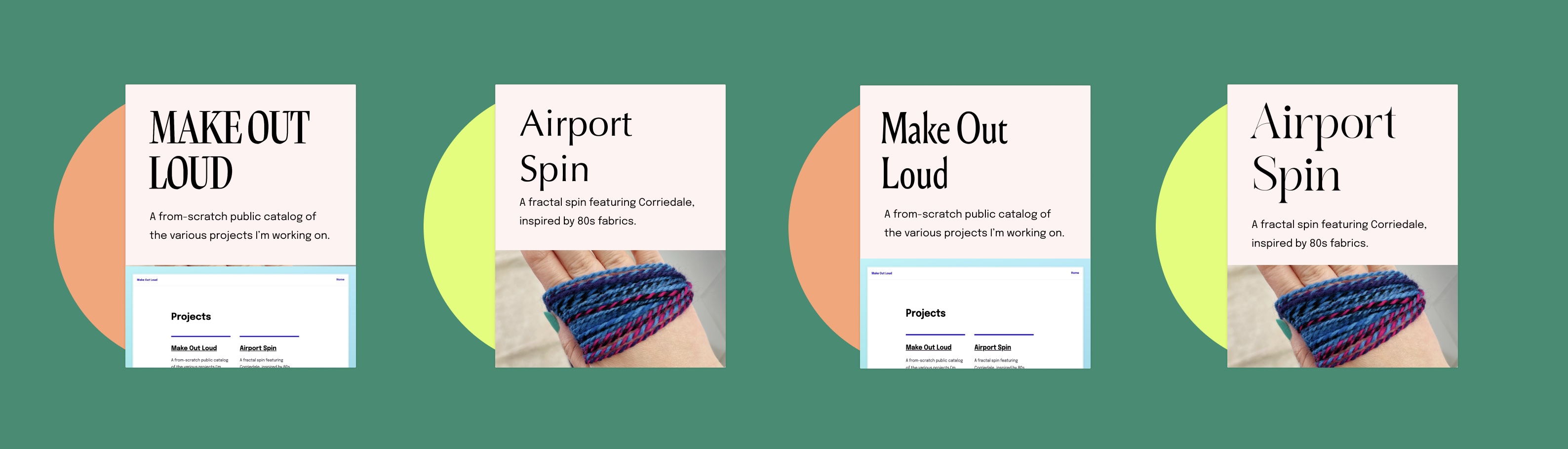
Almost forgot to update with the pretty large step change on this site! After the visual explorations from last week, I started playing around with this round-boi / record motif.
These are some of the sketchs. As you can see, when I’m sketching, it is objectively pretty ugly. I’m more trying out an idea than trying to make beauty. Rather quickly I hit on the sleeve motif as a possible solution that would work with different projects and project types.
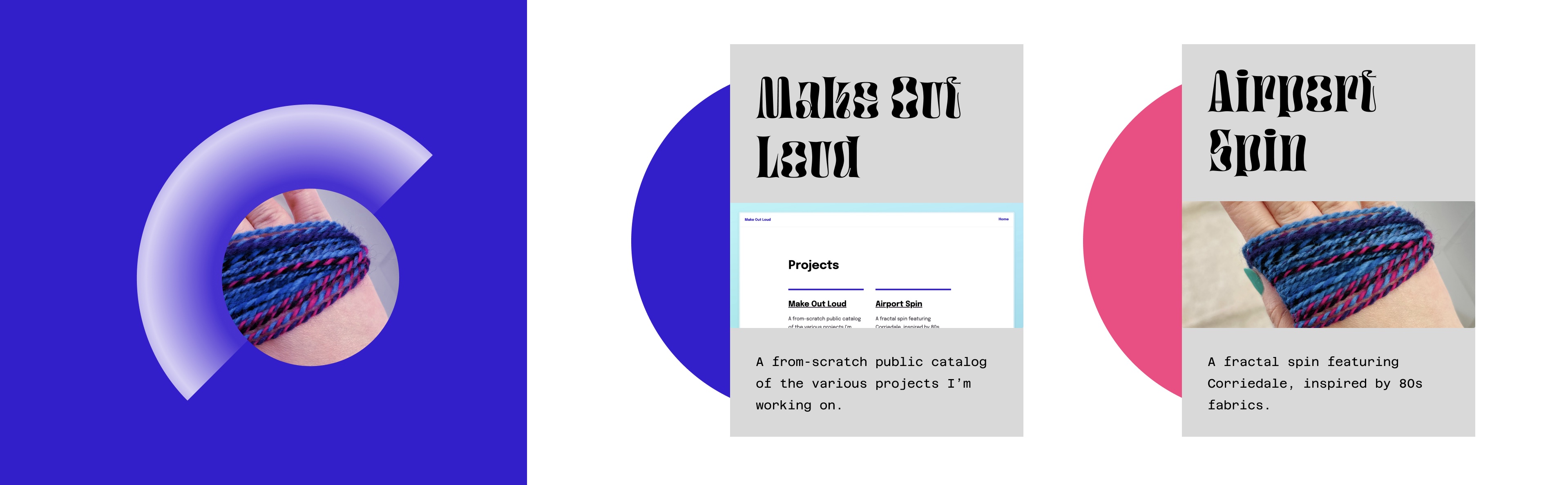
My vision for this eventually is to illustrate the ‘record’ portion of the project, and have it rotate slowly when you hover or focus it. I might also have it hovering slowly as a header in each post and project. However, this is where it’s best to bite off a little nibble, rather than wholesale try to finish everything. I chose a few colors that feel appealing to me in this present moment, and I’m just using those to earmark the ‘type’ of project. Orange-melon is spinning, and neon yellow is digital.
Next I tried some different headline faces. I want to take my time finding the right display face, as it’s looking quite pricy to buy a web license for any of them. For now, I went with a mildly quirky stand-in, which I’ll upgrade in a future pass.
Also, that site header lol. So unrefined.
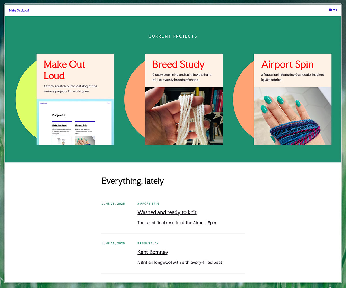
I restyled the lists as well to give them some semblance of hierarchy. So here is your before and after.
Before
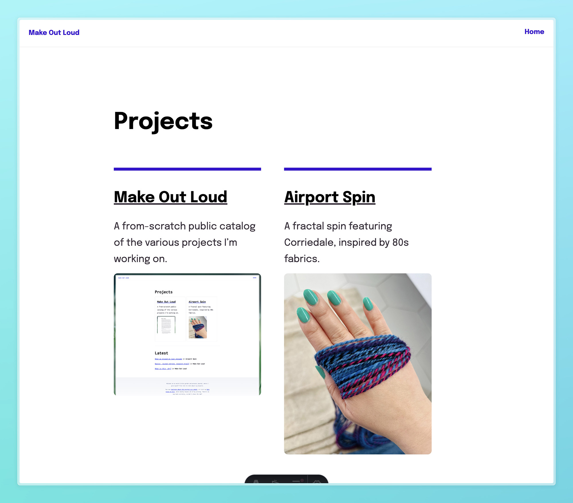
After
Graphics! Lists!